
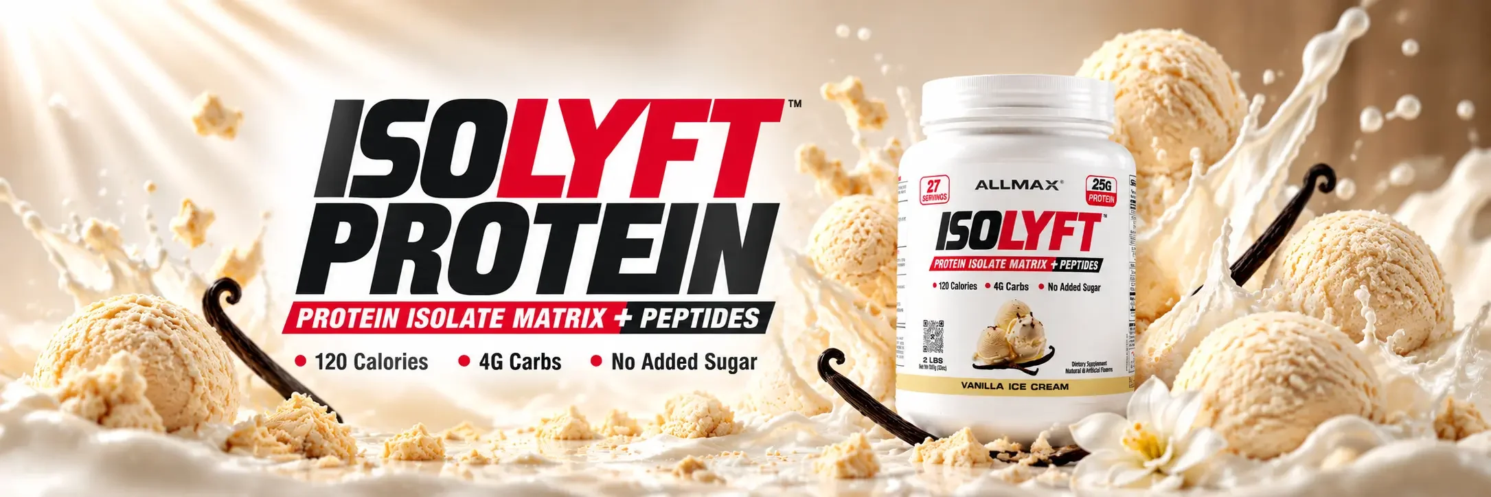
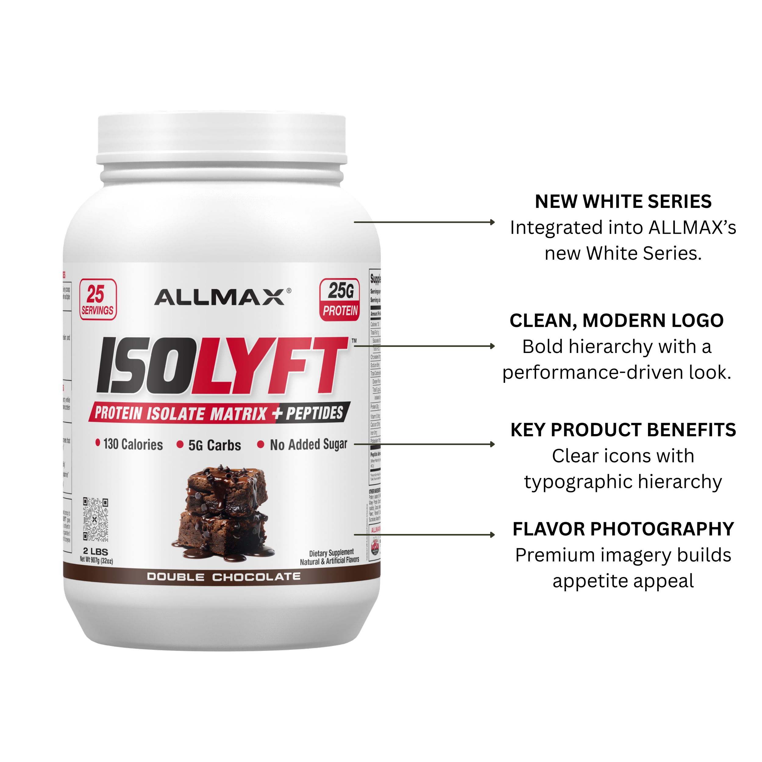
PACKAGING STRATEGY:
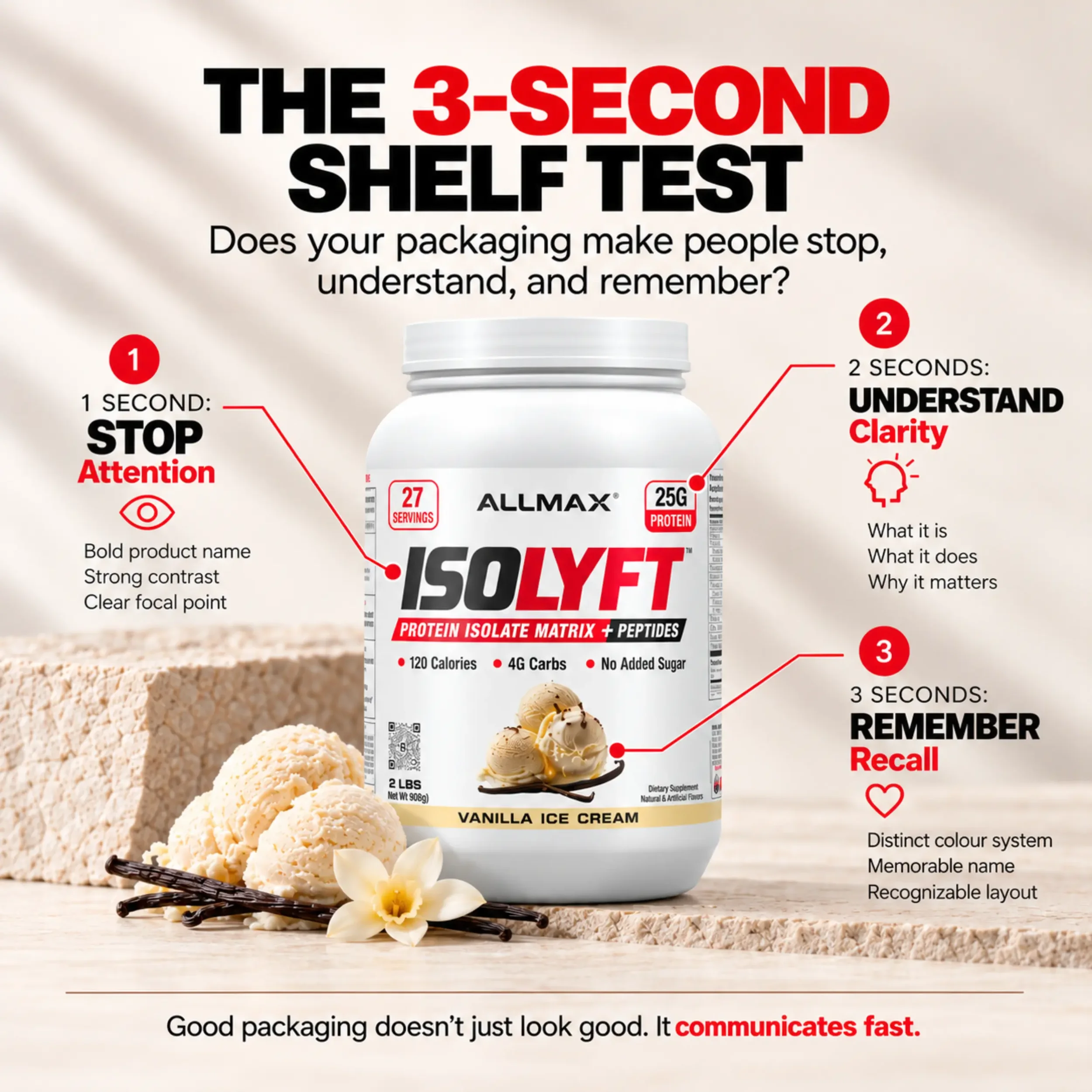
For the ISOLYFT packaging, I applied the 3-Second Shelf Test to ensure the design captures attention, communicates key product benefits, and leaves a lasting impression. Through bold typography, strong contrast, and a clear visual hierarchy, I wanted consumers to quickly recognize the product, understand what makes it different, and remember it. Every design choice was intentional, reinforcing the idea that great packaging doesn't just look good, it communicates fast..
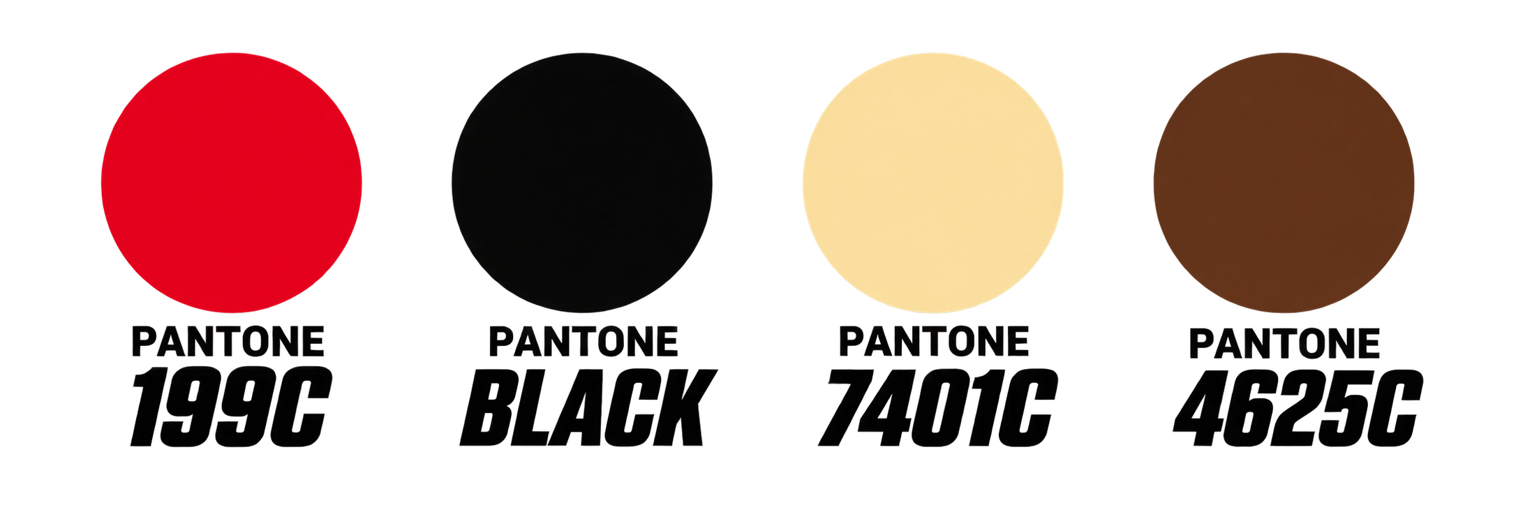
Colour Palette:
Isolate-Driven Protein + Peptides
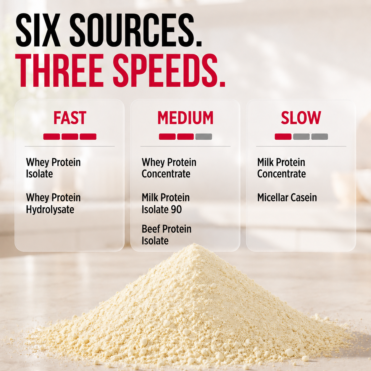
We chose “Isolate-Driven Protein + Peptides” to highlight what makes ISOLYFT different. It emphasizes the premium protein sources in its 6-protein blend and the added 470 mg Peptide Amino Matrix. The tagline is short, product-focused, and reinforces ALLMAX's science-driven approach to protein innovation.
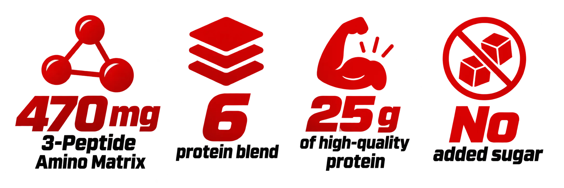
Key Messaging:
Tone of Voice
Confident, Technical, Performance-Driven, and Premium
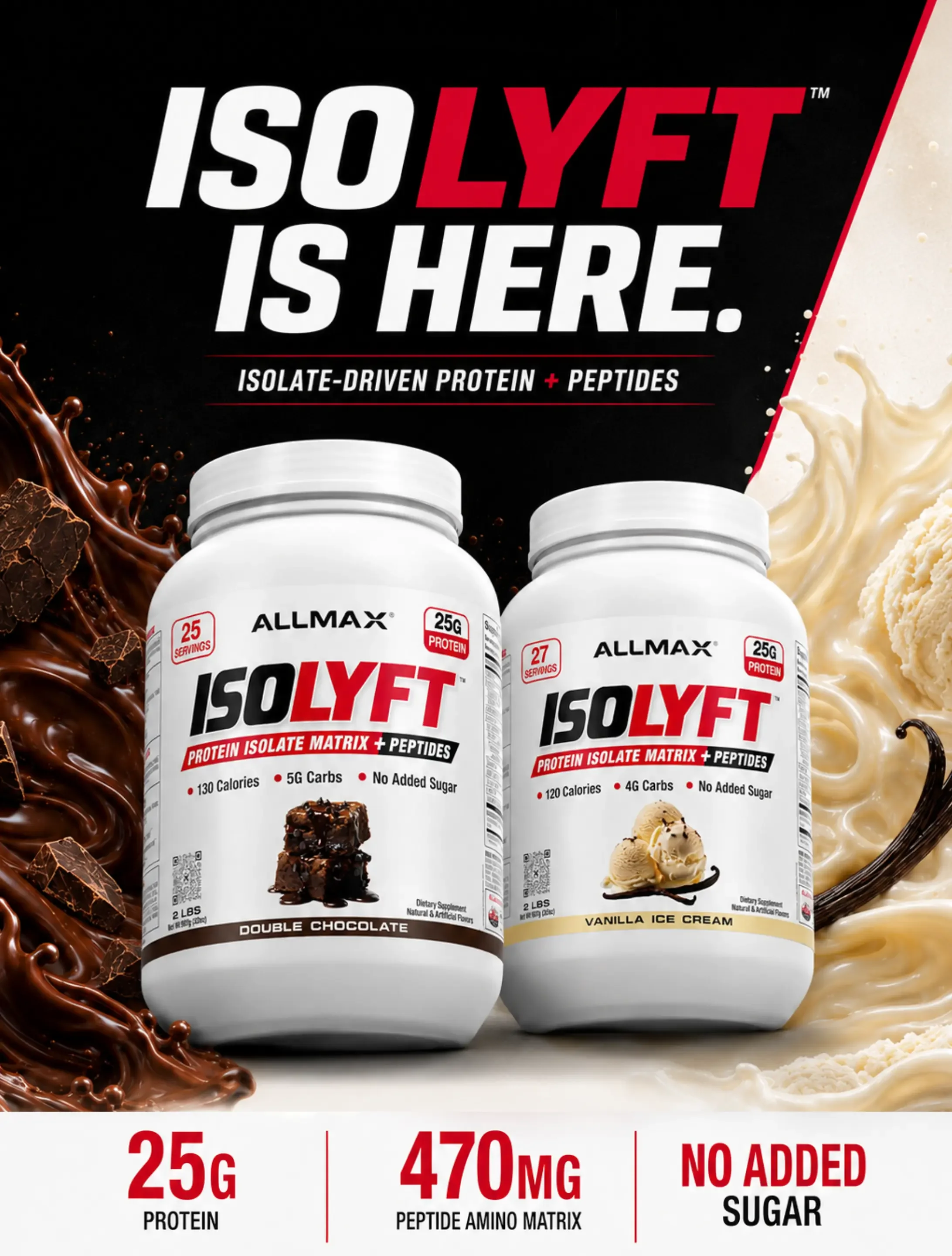
PRODUCT LAUNCH
Developed a bold, product-focused post introducing ISOLYFT's new protein formula, highlighting its premium ingredients, key benefits, and two flavours through impactful visuals and clear messaging.
15K+ VIEWS
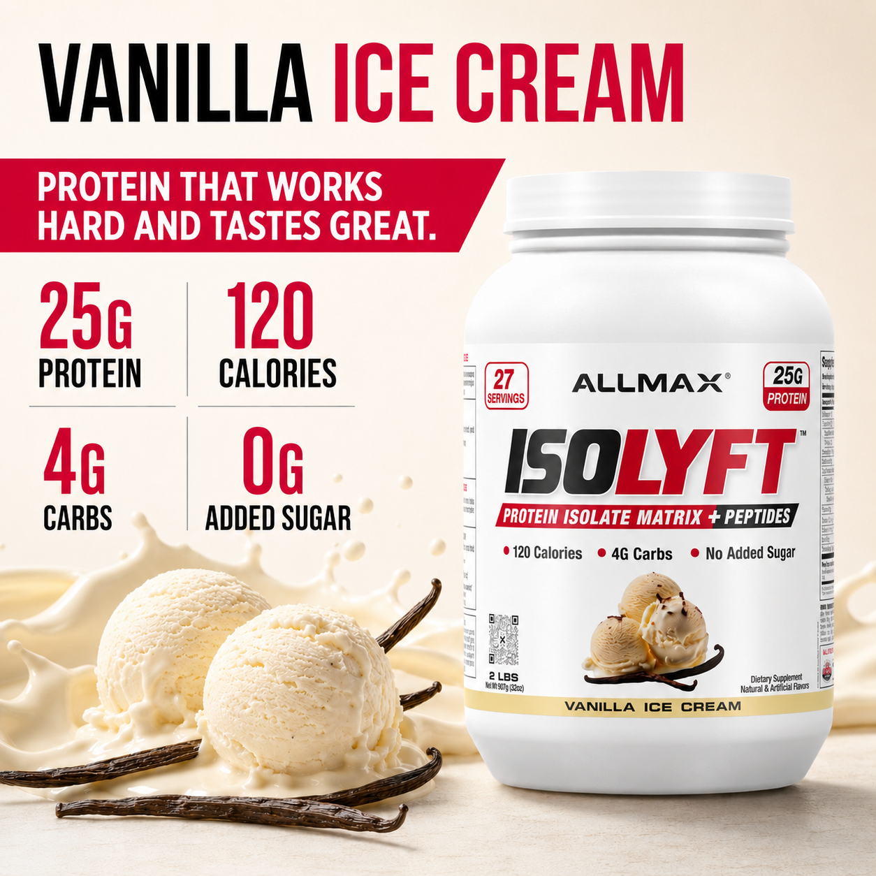
E-COMMERCE EXPERIENCE
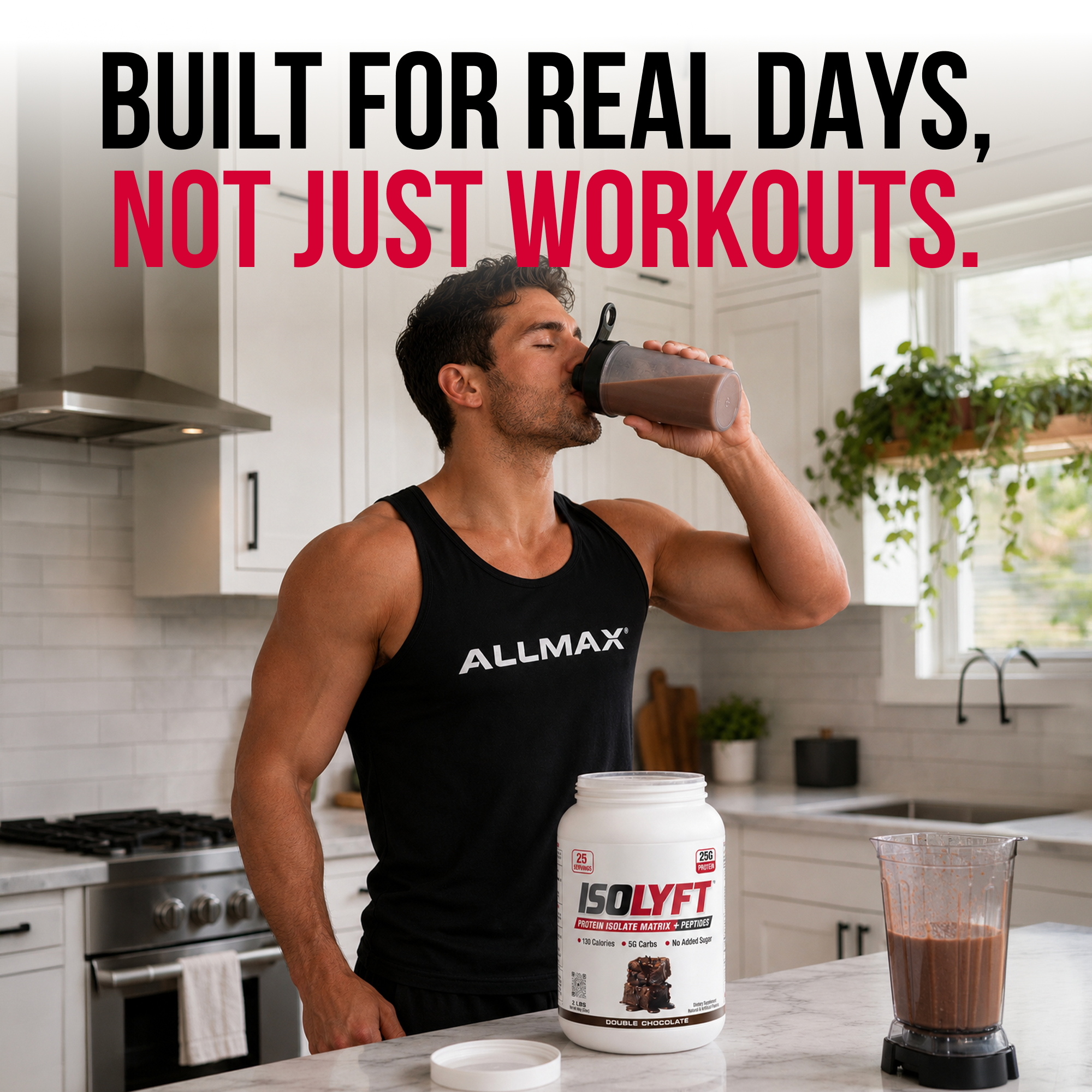
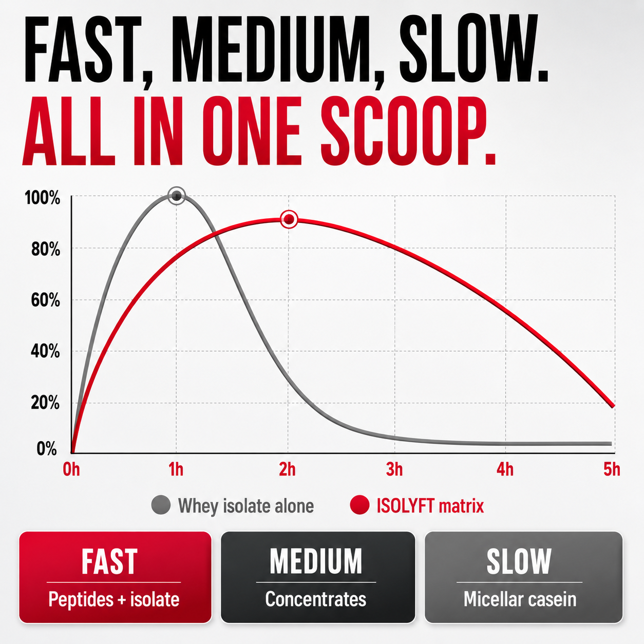
Concepted and designed the complete e-commerce visual experience, translating key product benefits into clear, high-impact assets built to educate and convert.