
WORK
CPG RE-DESIGNS
I approach CPG innovation through the intersection of brand strategy, consumer behavior, and design. These redesigns explore how established products can be evolved through stronger visual hierarchy, clearer communication, improved shelf presence, and a more cohesive brand experience.
Each concept focuses on preserving brand recognition while identifying opportunities to modernize packaging, strengthen product differentiation, and create a more compelling experience across both retail and digital touchpoints.
Aminocore
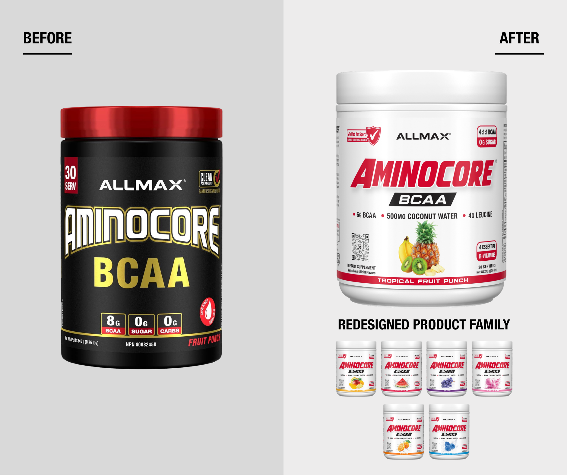
Packaging Re-Design Concept
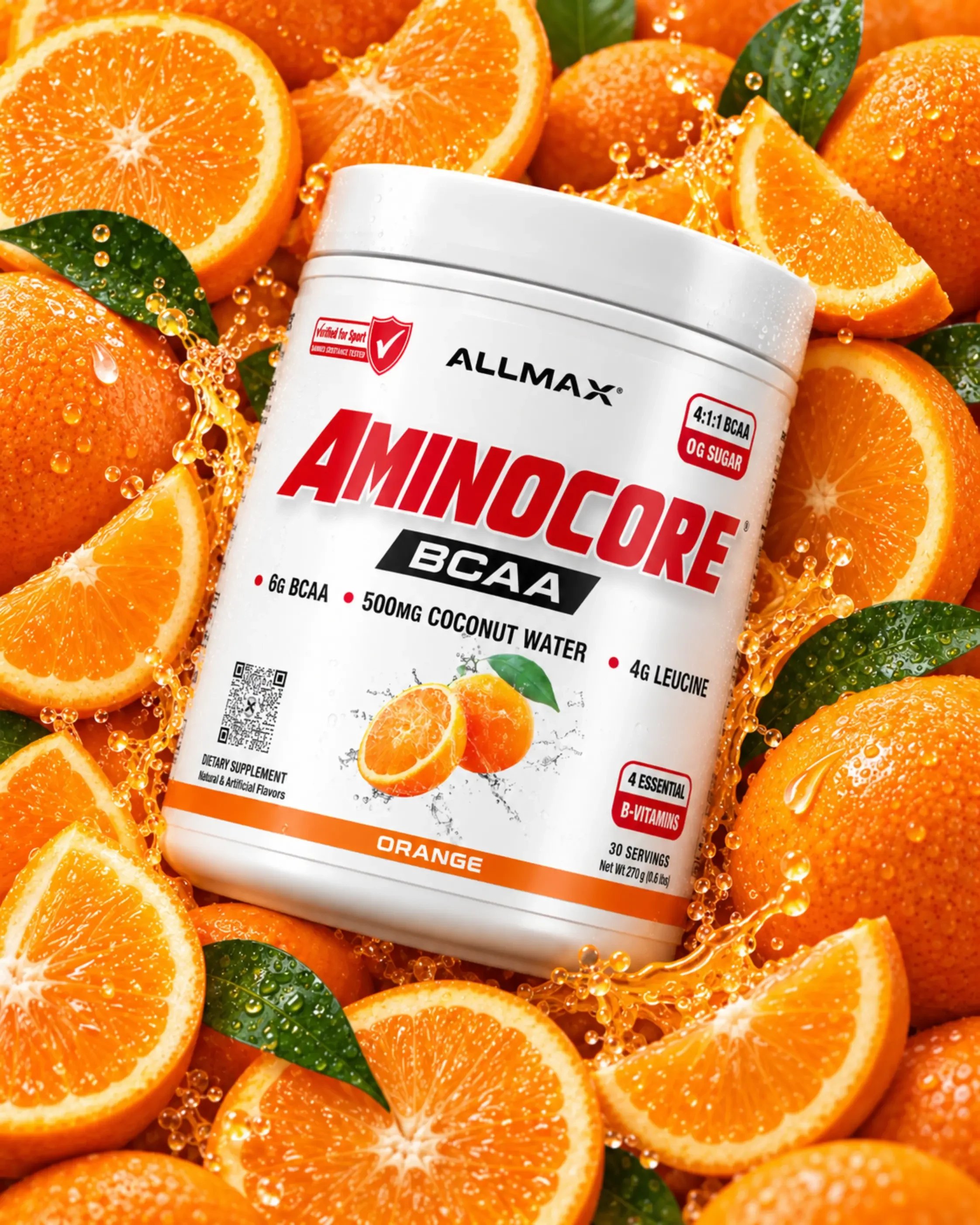
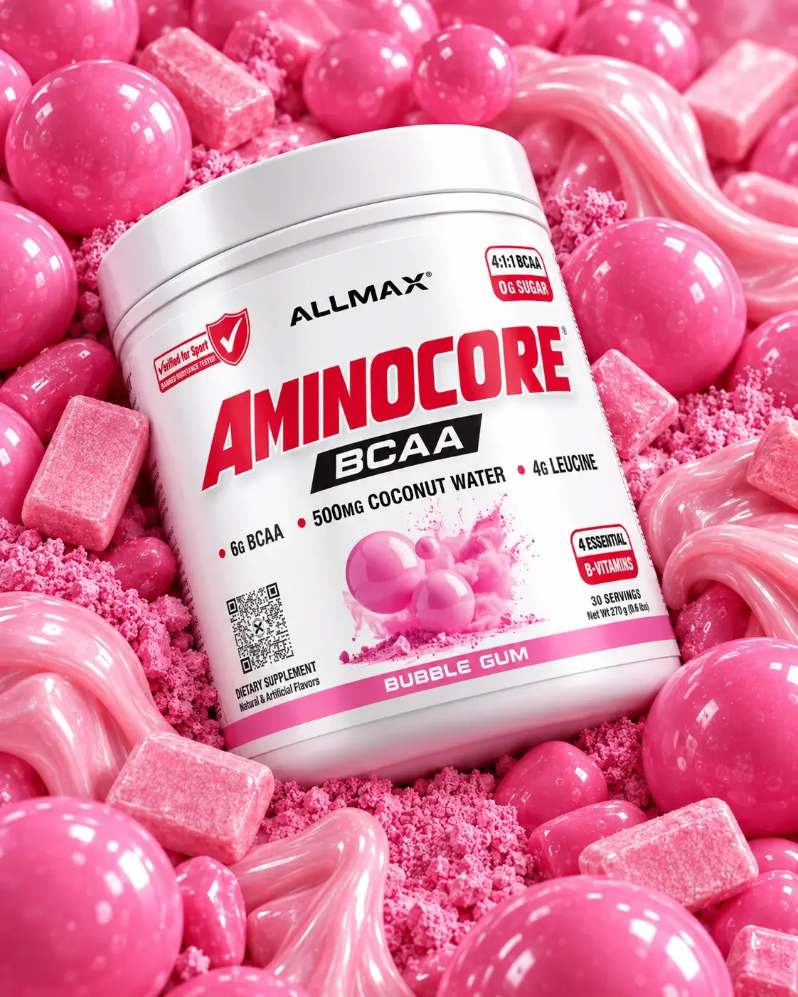
The objective was to modernize the AMINOCORE packaging system with a cleaner, more contemporary visual identity while improving hierarchy, flavor differentiation, and shelf presence.
HEXAPRO Protein Bar
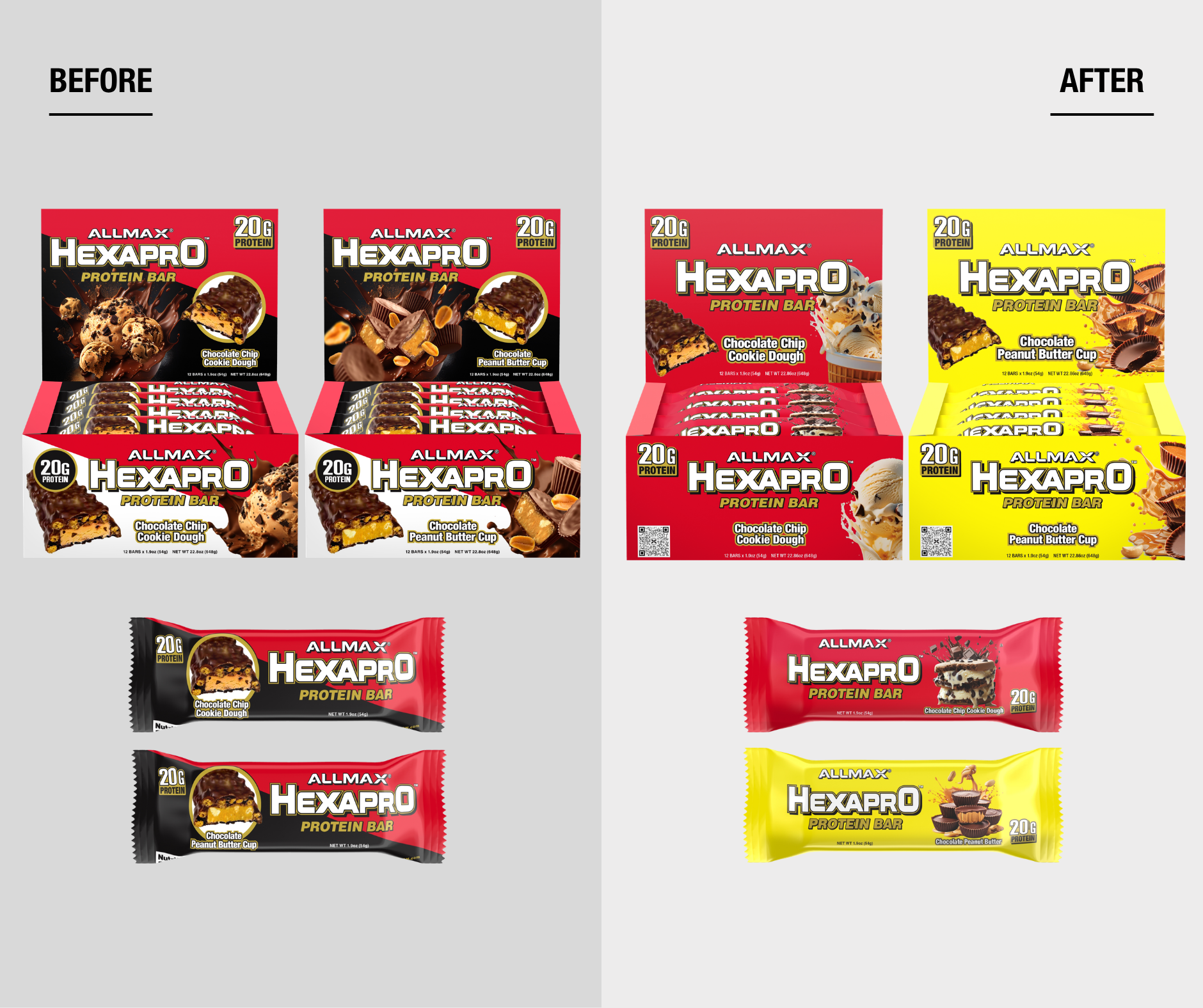
Packaging Re-Design Concept
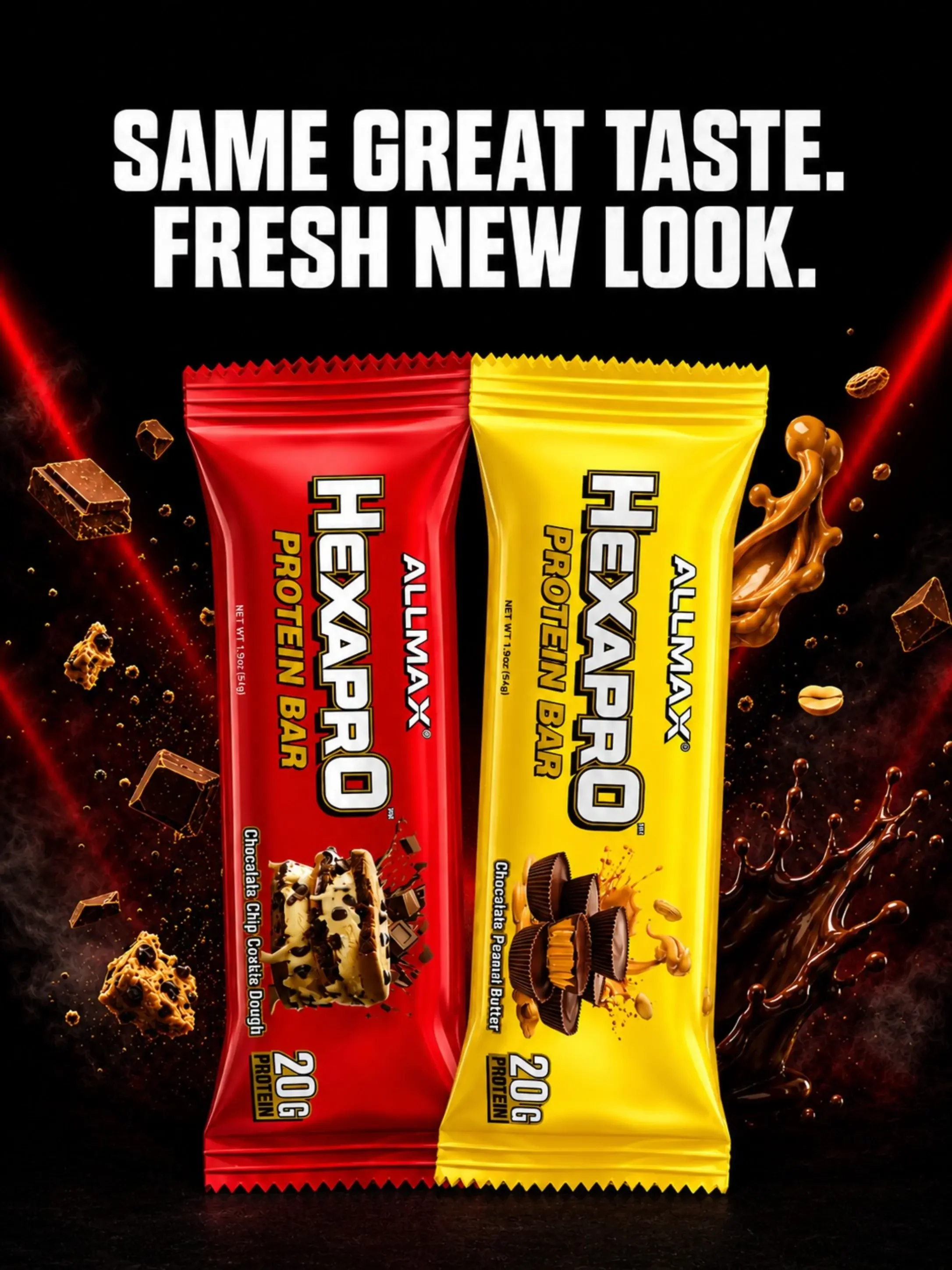
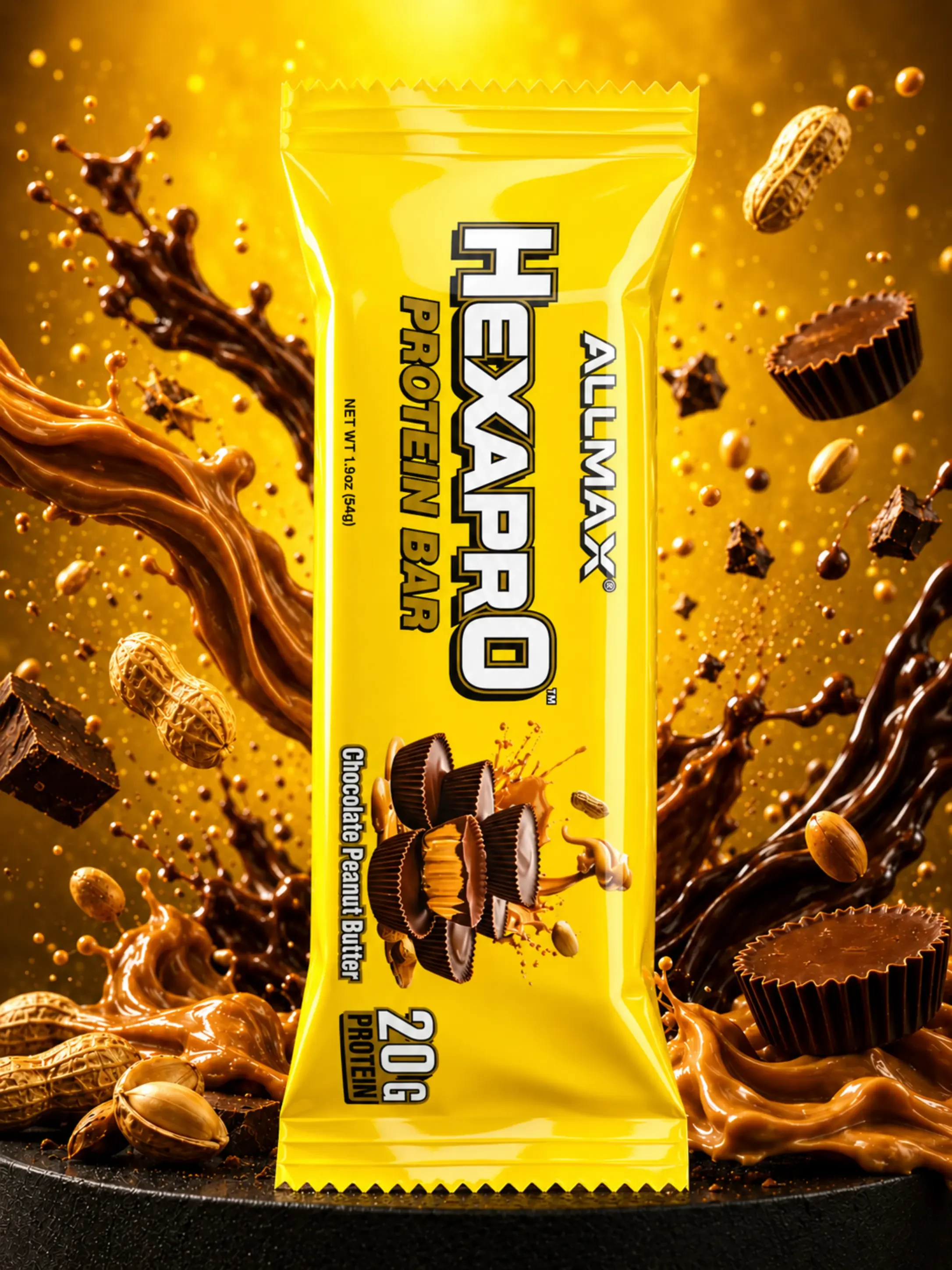
My objective was to modernize HEXAPRO Protein Bar packaging and create a fresher, more contemporary visual identity while improving flavor differentiation across the line. I replaced the heavier, darker look of the original packaging with brighter colors, cleaner layouts, simplified visual hierarchy, and more dynamic imagery.
Allwhey Gold/Classic

Packaging Re-Design Concept
The ALLWHEY packaging was redesigned with a cleaner, more modern and premium look, strengthening the ALLWHEY name as the focal point while creating clearer hierarchy for key nutrition information. Updated product photography, typography and spacing also improve flavor appeal and consistency across the full range.
-
01 — Stronger Hierarchy
The ALLWHEY name was given more prominence so the product is easier to recognize at a glance.02 — Clearer Nutrition Communication
Protein, sugar, carbs and calories were reorganized into a simpler system for faster readability.03 — Stronger Flavour Appeal
Larger food imagery gives each flavour more personality and improves appetite appeal.04 — Consistent Brand Architecture
The same visual language carries across tubs, packets and retail displays for a more unified range. -
A black-led foundation keeps the range bold and performance-focused, while blue, gold and flavour-specific accents help distinguish formulas and flavours.
Typography was simplified to give ALLWHEY greater prominence, while nutrition information was reorganized into a cleaner, more consistent system. I also updated the flavor image which helps adds stronger appeal and gives each SKU a more premium presence.
-
I simplified the front panel to create clearer hierarchy, made ALLWHEY the main focal point for stronger recognition, and used colour to distinguish formulas while keeping the range cohesive. Nutrition callouts were streamlined for faster readability, while larger flavour photography added stronger appetite appeal and helped each SKU feel distinct.